Materials Analysis


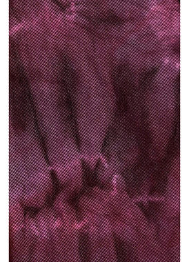
My favourite starting is garment 3 because the cotton material is a great base for dyeing and other techniques, as well as being a foundation with a lot of fabric to develop my design from. It is also helpful that it is a size 12 because I plan to fit my final outfit for a size 6 model. I think I may struggle to implement garment 2 because it may contain polyester which will not take to dye and easily as 100% cotton. Materials 1 and 4 have similar colouring so initially I think I will try and follow this colour palette which I have also explore in my concept development.
Textile Exploration

Pleating, could be a good way to utilise extra fabric.


Created ruffles by cutting circles from scrap and stitching them closely on a swatch, creating texture, good use of scrap fabric.
Used scrap fabric to use ad padding in between pieces of fabric, good use of scrap fabric.
Experimenting with zig-zag stitching wool and string to a swatch, could be interesting textile embellishment.
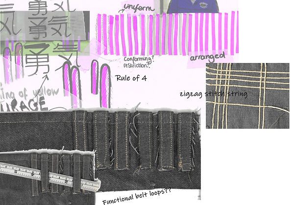
Taking one of my concept pages, deciding to experiment with the four pillars and their uniform positions.
One textile experiment was formed by zig-zag stitching string to the fabric, I did not really like the side where the string was visible but I did like the texture created on the reverse side.
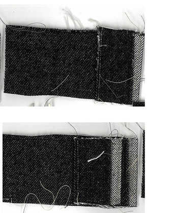
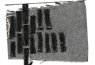
I also liked the effect from topstitching rolled/folded pieces to the edge of the fabric, I thought it could potentially be added to a hem, cuff or waistband; where they could possibly functional belt loops.

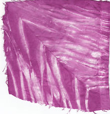
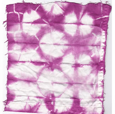
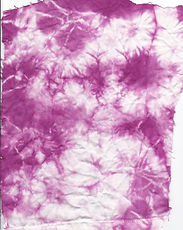
Dye sampling


Sample was wrapped and scrunches around cylinder.
I liked this effect but I would prefer there be more white area. Might need thicker string. It may be more difficult to execute this with bigger fabric pieces
Sample was folded methodically. Because of how this was folded less dye seemed to reach the centre and with bigger pieces of fabric I think this will create an issue.
Experimenting with different colours. I really liked this textile, I think it links to my concept with the use of colours. It reminds me of the lights in the night. The colours compliment each other while and I can convey the conflicting feelings of the characters from the music video.
Draping
Sample was scrunched and tied randomly. I liked the messy effect of this sample. I would have to consider how I tie the fabric to adjust where the dye penetrates. I think this method would be the easiest to execute with larger fabric pieces.
Please scroll to see all designs


In this part of my design process I started to drape on the stand using the materials I was supplied with. To establish different shapes/silhouettes and ideas I positioned and pinned my materials as expressively as I could, and in a way which seeded ideas of how I could use these materials practically.
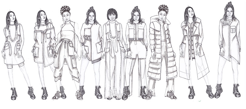
COLLAGE DESIGNS
Please scroll to see all designs


Using my standwork, I collaged with it in photoshop, which I prefer to manually collaging, then printed them and worked into the more to develop my ideas. I then moved of to sketching, using both my stand work and collages to help me.
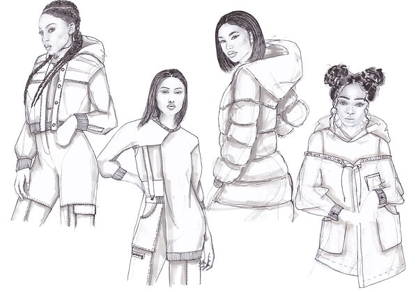
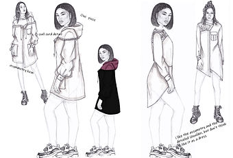
Design Development
Please scroll to see all designs


Colour exploration
Using some of my developed designs and my past concept pages I worked on different colour combinations which could potentially be my final colour palette.

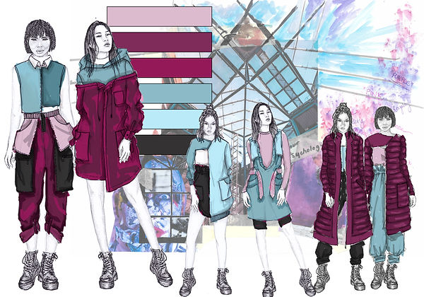
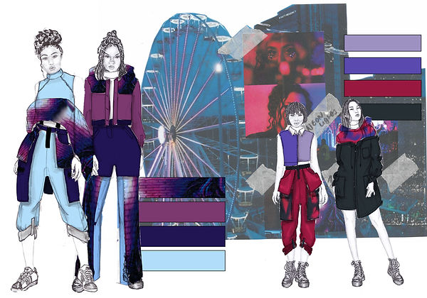

This colour combination comes from my dyeing sampling.
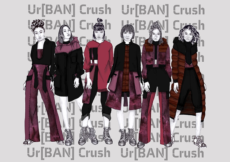
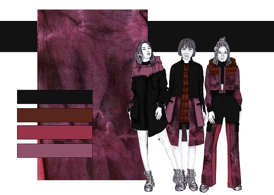
Final Line up